In the previous post I’ve introduced App Studio, a new tool from Microsoft to easily create Windows Phone applications. You’ll be able to define the application’s content with a series of wizards and, in the end, to deploy your application on the phone or to download the full Visual Studio project, so that you can keep working with it and add features that are not supported by the web tool. Right now access to the tool, due to the big success that caused some troubles in the past days, can be accessed only with an invite code. If you’re really interested in trying it, send me a mail using the contact form and I’ll send you an invite code. First come, first served!
Let’s see in details how to use it and how to create our first app. We’re going to create a sample comic tracker app, that we can use to keep track of our comics collection (I’m a comics fan, so I think it’s a good starting point ![]() ). In these first posts we’ll see how to create the application just using the web tool: then, we’ll extend it using Visual Studio, to provide content editing features (like adding, deleting or editing a comic), since actually the web tool doesn’t support this scenario.
). In these first posts we’ll see how to create the application just using the web tool: then, we’ll extend it using Visual Studio, to provide content editing features (like adding, deleting or editing a comic), since actually the web tool doesn’t support this scenario.
Let’s start!
Empty project or template?
The first thing to do is to connect to http://apps.windowsstore.com and sign in with your Microsoft Account: then you’ll have the chance to create an application from scratch or to use one of the available templates. Templates are simply a collection of already pre populated items, like pages, menus and sections. We’re going to create an empty app, so that we can better familiarize with the available options. So, choose Create an empty app and let’s start!
Step 1: App Information
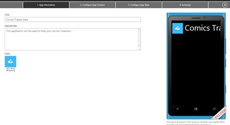
The first step is about the basic apps information, which are the title, the description and the logo (which is a 160×160 PNG image). While you fill the required information, the phone image on the right will be updated live to reflect the changes.
There isn’t too much to see in the preview, since we’ve just defined the basic information. Let’s move on the second step, when we’ll start to see some interesting stuff.
Configure App Content
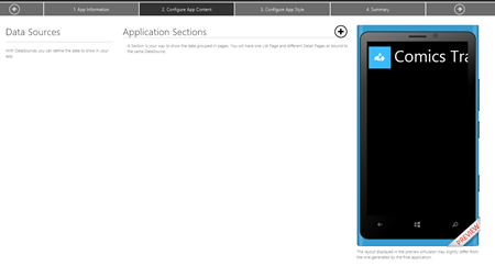
In this section we’re going to define the content of our application and it’s, without any doubt, the most important one. Here is how the wizard looks like for an empty app:
The app content is based on two key concepts, which are strongly connected: data sources and sections. Data sources are, as the name says, the “containers” of the data that we’re going to display in the application. There are 4 different data sources’ types:
- Collection is a static or dynamic collection of items (we’ll see later how to define it).
- RSS is a dynamic collection of items, populated by a RSS feed.
- YouTube is a collection of YouTube videos.
- Html isn’t a real collection, but just a space that you can fill with HTML content, like formatted text.
Each data source is connected to a section, which is the page (or the pages) that will display the data taken from the source: it can be made by a single page (for example, if it’s a Html data source) or more pages (for example, if it’s a collection or RSS data source that has a main page, with the list of items, and a detail page).
As suggested by the Windows Phone guidelines, the main page of the application is a Panorama that can have up to 6 sections: each section added in this view will be treated like a separated PanoramaItem in the XAML. This means that you’ll be able to jump from one section to another simply by swiping on the left or on the right.
If you want to add more than 6 sections, you can choose to add a Menu, which is a special section that simply displays a list of link: every link can be a web link (to redirect the user to a web page) or a section link, which redirects the user to a new section. The setup process that I’m going to describe it’s exactly the same in both case: the only difference is that, if the section is placed at the main level, it will be displayed directly in the panorama; if it’s inserted using a menu, it will be placed in another page of the application.
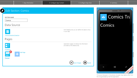
Let’s see how to define a section: you can add it by clicking on the “+” button near the Application Sections header. Here is the view that is displayed when you create a new section.:
You can give a name to the section and choose which is the data source’s type that will be connected: once you’ve made your choice, you simply have to give to the source a name and press the Save changes button. In this sample, we’re going to create a data source to store our comics, which is a Collection data source.
Here is how a typical data source looks like: the tool has already added for us two pages; a master one, which will be included in the Panorama and will display the list of items; a detail one, which is a different page that will be displayed when the user taps on an item to see the details.
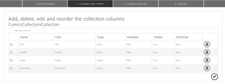
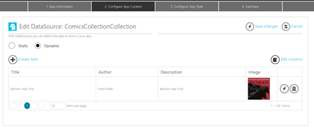
To see how you can customize a data source, click on the ComicsCollection we’ve just created: you’ll see a visual editor that that can be used to define your data source. A collection data source is just a table: data will be automatically pulled and displayed in the application. By default, a collection data source already contains some fields, like Title, Subtitle, Image and Description. You can customize them by clicking the Edit columns button (it’s important to define the fields as first step, since you can’t change them after you’ve inserted some items).
The editor is simple to use:
- You can add new columns, by clicking the Add new column button.
- You can delete a column, by clicking the Bin icon near avery field.
- You can reorder columns, by dragging them using the first icon in the table.
You’ll be able to create fields to store images, texts or numbers. After you’ve set your collection’s fields, you can use the available editor to start adding data; a nice feature is that you can choose if your collection is static or dynamic. Static means that the application will contain just the data that you’ve inserted in the editor: the only way to add new data will be to create an application update and submit it to the store. Dynamic, instead, means that the data inserted in your collection will be available through an Internet service: you’ll be able to add new data by simply inserting new items in the collection’s editor. The application will automatically download (like if it’s a RSS feed) and display them.
Once you’ve defined your data source, it’s time to customize the user interface and define how to display the data. As we’ve seen, the tool has automatically created two pages for us: the list and the detail page. However, we can customize them by clicking on the desired page in the editor:
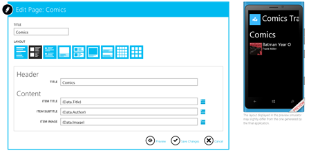
In this editor you can customize the title, the layout (there are many available layouts for different purposes, for example you can choose to create an image gallery) and the content. The content editor will change, according to the layout you’ve selected: in the previous sample, we have chosen to use a list layout, so we can set which data to display as title, subtitle and image. If we would have chose an image gallery layout, we would have been able just to set the image field.
The data to display can be picked from the data source we’ve defined: by clicking on the icon near the textbox, we can choose which of the collection’s fields we want to connect to the layout. In the sample, we connect the Title to the comic’s title, the Subtitle to the comic’s author and the Image to the comic’s cover. We can update the preview in the simulator by clicking the Preview icon: items will be automatically pulled from the data source.
The detail page editor is similar: the only difference is that the available layouts will be different, since they are specific for detail pages. Plus, you’ll have access to a section called Extras, which you can use to enable Text To Speech features (the application will read the content of the specified field) and Pin To Start (so that the user can create a shorcut in the home screen to directly access to the detail’s page).
Configure App Style
This section is used to configure all the visual features of the applications: colors, images, tiles, etc. The section is split into three tabs: style, tiles and splash & lock.
Style
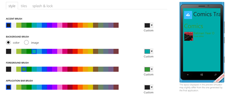
The Style section can be used to customize the application’s colors: you can choose between a predefined list or by picking a customized one, by specifying the hexadecimal value.
You can customize:
- The accent brush, which is the color used for the main texts, like the application’s title.
- The background brush, which is the background color of all the pages. You can choose also to use an image, which can be uploaded from your computer.
- The foreground brush, which is the color used for all the texts in the application.
- The Application bar brush, which is the color of the application bar.
Tiles
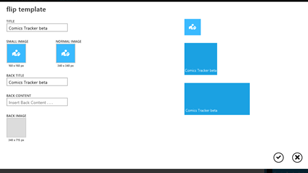
In this section you’ll be able to customize the tile and to choose one of the standard tile templates: flip, cycle and iconic. Cycle will be available only if you use a static collection data source, since the generated application is not able to pull images from remote and to use them to update the tile.
According to the template, you’ll be able to edit the proper information: by default, the tile will use, as background image, the application’s icon you’ve uploaded in the first step, but you’re free to change it with a new image stored on your computer. On the right the tool will display a live preview of how the tile looks like.
Splash & lock
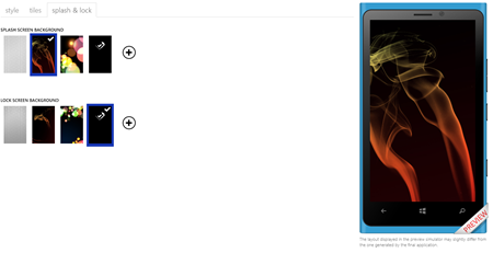
This last section can be used to customize the splash screen and the lock screen. The generated application, in fact, is able to set an image as lock screen, using the new APIs added in Windows Phone 8. In both cases you can choose between a list of available images or upload your custom one from your hard disk.
Summary
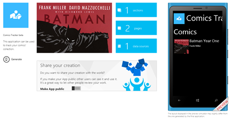
We’re at the end of the process! The summary page will show you a recap of the application: the name, the icon and the number of sections, pages and data sources we’ve added.
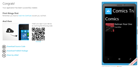
To complete the wizard you need to click the Generate button: the code generation process will start and will complete within minutes. You’ll get a mail when the process is finished: one of the cool App Studio features is that you’ll be able to install the created application on your phone even if it’s not unlocked and without having to copy the XAP file using the Application Deployment tool that is included in the SDK. This is made possible by using an enterprise certificate, that will allow you to simply download the XAP using the browser and to install it. This is why the e-mail you’ve received is important: it contains both the links to the certificate (that you’ll have to install first) and to the application. Installing the certificate it’s easy: just tap on the link on your phone; Windows Phone will open Internet Explorer and download the certificate, then it will prompt you if you want to add a Company account for Microsoft Corporation . Just choose “Yes” and you’re done: now you can go back to the portal, where you’ll find a QR Code that points to the application’s XAP. Just decode it using the native Bing Vision feature (press the Search hardware button, tap on the Eye icon and point the phone’s camera towards the QR code): again, Windows Phone will open Internet Explorer, download the XAP file and it will prompt you if you want to install the company app. Just tap Yes and, after a few seconds, you’ll find your app in the applications list.
The tool will provide you also two other options:
- Download source code will generate the Visual Studio project, so that you can manually add new features to the application that are not supported by the tool.
- Download publish package will generate the XAP file required if you want to publish the application on the Store.
Have fun!
Now it’s your turn to start doing experiments with the tool: try to add new sections, new pages or to use one of the already existing templates. Anytime, you’ll be able to resume your work from the Dashboard section of the website: it will list all the applications you’ve created and you’ll be able to edit or download them.
In the next posts, we’ll take a look at the code generated by the tool and how we can leverage it to add new features.



I’m using this tool, and whenever I create an empty app, and put together some sections, the first home screen always has an app bar with a “lock screen” item on it. Is there any way to remove this?
I’ve searched quite a bit but no luck :/
Hi Max,
as far as I know actually the only way to remove the lock screen feature is by manually editing the generated Visual Studio project. Good feedback anyway, I’ll report your suggestion to the App Studio team!