In the previous posts we’ve seen that one of the requirements to setup the Prism infrastructure is to change the Views in our application so that, instead of inheriting from the Page class, we inherit from the VisualStateAwarePage one. One of the features offered by this class is the layout management support: by using visual states, we’ll be able to easily manage the different visual layouts that the application can take advantage of.
Unfortunately, at the moment, this feature is supported only in Windows 8 applications. The VisualStateAwarePage offers, automatically, three different visual states:
- DefaultLayout is the standard layout that is used when the application is displayed in landscape mode (which is the default one on Windows 8 devices).
- PortraitLayout is the layout that is used when the application is displayed in portrait mode.
- MinimalLayout is the layout that is used when the application is resized and its width reaches a value that it’s not enough anymore to display the standard layout, so we need to change it.
Let’s see how to implement these scenarios.
Managing the portrait layout
Thanks to the visual states approach, we’ll be able to change the layout by simply specifying, using the XAML, the differences compared to the standard layout. Let’s see the following sample:
<storeApps:VisualStateAwarePage
    x:Class="Prism_LayoutManagement.Views.MainPage"
    xmlns="http://schemas.microsoft.com/winfx/2006/xaml/presentation"
    xmlns:x="http://schemas.microsoft.com/winfx/2006/xaml"
    xmlns:local="using:Prism_LayoutManagement.Views"
    xmlns:d="http://schemas.microsoft.com/expression/blend/2008"
    xmlns:mc="http://schemas.openxmlformats.org/markup-compatibility/2006"
    xmlns:storeApps="using:Microsoft.Practices.Prism.StoreApps"
    xmlns:mvvm="using:Microsoft.Practices.Prism.Mvvm"
    mc:Ignorable="d"

    mvvm:ViewModelLocator.AutoWireViewModel="True"
    Background="{ThemeResource ApplicationPageBackgroundThemeBrush}">


    <Grid>
        <VisualStateManager.VisualStateGroups>
            <VisualStateGroup>
                <VisualState x:Name="DefaultLayout"/>
                <VisualState x:Name="PortraitLayout">
                    <Storyboard>
                        <ObjectAnimationUsingKeyFrames Storyboard.TargetName="ButtonsPanel"
                                                   Storyboard.TargetProperty="Orientation">
                            <DiscreteObjectKeyFrame KeyTime="0" Value="Vertical" />
                        </ObjectAnimationUsingKeyFrames>
                    </Storyboard>
                </VisualState>
            </VisualStateGroup>
        </VisualStateManager.VisualStateGroups>

        <StackPanel x:Name="ButtonsPanel" Orientation="Horizontal">
            <Button Content="Button 1" />
            <Button Content="Button 2" />
            <Button Content="Button 3" />
            <Button Content="Button 4" />
        </StackPanel>

    </Grid>
</storeApps:VisualStateAwarePage>
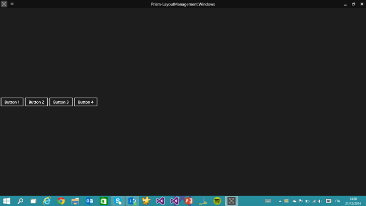
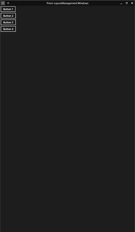
The page simply contains four Button controls, which are placed inside a StackPanel which Orientation property is set to Horizontal. This means that, when the page is displayed using the default layout (which is the landscape mode), the four buttons are displayed one near the other. Our goal is to change this layout so that, when the application is used in portrait mode, the buttons are displayed one below the other.
Let’s introduce the VisualStateManager, which is the class that is able to manage the different visual states of a control. Each visual state matches one of the possible status of the control: for example, the Button control uses a visual state to define how it should look like when it’s pressed. As we’ve already mentioned, the best advantage of this approach is that we won’t have to define the whole layout of the control every time, but it’s enough to define the differences between one state and the other. For example, the Pressed state of the Button control simply specifies that, compared to the standard layout, the background of the button should be white instead of black, while the text should be black instead of white.
We use the same approach to manage the different layouts of the page: inside the VisualStateManager we’ve added inside the main Grid, we add a list of VisualState items, each one with a specific name that follows the Prism conventions. The standard one is called DefaultLayout: it’s empty, since it’s the base definition of the page. Then we create a new one for the portrait mode, which name is PortraitLayout: inside it, by using animations, we specify the differences with the default layout. In our sample, we define a Storyboard with a single ObjectAnimationUsingKeyFrames animation, which simply changes the value of the Orientation property of the StackPanel: from Horizontal to Vertical. If we would have needed to change other controls, we would have simply added other animations inside the Storyboard.
If you want to test the code we’ve written, you can use the Windows 8 simulator: in the Debug dropdown menu, simply choose Simulator instead of Local machine. The simulator, in fact, offers an option to simulate the rotation of the device, which is very useful if you’re developing and testing your application on a traditional computer.
Managing the resize of the application
If you’re a Windows 8 user, you should be familiar with the concept of “snapped”: you have the chance to keep multiple applications opened at the same time and to place them side by side. In Windows 8.1, this feature has been improved: if, in Windows 8, the snapped view had a fixed size, in Windows 8.1 the user is able to resize the width of the application to virtually any size, until it reaches a minimum width (by default it’s 500px, but it could be changed to 320px).
As developers, we need to correctly manage this scenario, so that we can provide a good user experience, regardless of the size of the application. The first step to achieve this goal is to create a fluid layout, by using controls (like Grid) that are able to adapt their content to the window’s size. This way, if the user resizes the application, the layout will automatically adapt to display as more content as possible. If you’re familiar with web development, this approach is very similar to the responsive design concept that applies to websites, so that they can automatically adapt to the screen’s size (pc, tablets, smartphones, etc.).
However, this step isn’t enough: if the application’s window becomes too small, it can be hard to display the content by using the same layout and control we’re using with the standard layout. The easiest way to manage this scenario is to use, again, visual states: when the application’s size goes below a minimum width that, according to our design, isn’t enough anymore to properly display the content, we switch to another layout.
This goal is reached in the same way we’ve seen before to manage the portrait mode: by defining a new visual state, identified by the key MinimalLayout, with the difference with the default layout. Let’s take a look at the following sample:
<storeApps:VisualStateAwarePage
    x:Class="Prism_LayoutManagement.Views.MinimumWidthPage"
    xmlns="http://schemas.microsoft.com/winfx/2006/xaml/presentation"
    xmlns:x="http://schemas.microsoft.com/winfx/2006/xaml"
    xmlns:local="using:Prism_LayoutManagement.Views"
    xmlns:d="http://schemas.microsoft.com/expression/blend/2008"
    xmlns:mc="http://schemas.openxmlformats.org/markup-compatibility/2006"
    xmlns:storeApps="using:Microsoft.Practices.Prism.StoreApps"
    xmlns:mvvm="using:Microsoft.Practices.Prism.Mvvm"
    mvvm:ViewModelLocator.AutoWireViewModel="True"
    mc:Ignorable="d">

    <storeApps:VisualStateAwarePage.Resources>
        <CollectionViewSource Source="{Binding Path=Persons}" x:Name="PersonsCollection"/>
    </storeApps:VisualStateAwarePage.Resources>

    <Grid Background="{ThemeResource ApplicationPageBackgroundThemeBrush}">
        <VisualStateManager.VisualStateGroups>
            <VisualStateGroup>
                <VisualState x:Name="DefaultLayout"/>
                <VisualState x:Name="MinimalLayout">
                    <Storyboard>
                        <ObjectAnimationUsingKeyFrames Storyboard.TargetName="GridPersons"
                                                   Storyboard.TargetProperty="Visibility">
                            <DiscreteObjectKeyFrame KeyTime="0" Value="Collapsed" />
                        </ObjectAnimationUsingKeyFrames>
                        <ObjectAnimationUsingKeyFrames Storyboard.TargetName="ListPersons"
                                                   Storyboard.TargetProperty="Visibility">
                            <DiscreteObjectKeyFrame KeyTime="0" Value="Visible" />
                        </ObjectAnimationUsingKeyFrames>
                    </Storyboard>
                </VisualState>
            </VisualStateGroup>
        </VisualStateManager.VisualStateGroups>

        <GridView ItemsSource="{Binding Source={StaticResource PersonsCollection}}" SelectionMode="None" IsItemClickEnabled="True"
                  Margin="120, 0, 12, 0" x:Name="GridPersons" >
            <GridView.ItemTemplate>
                <DataTemplate>
                    <Grid HorizontalAlignment="Left" Width="250" Height="250">
                        <Border Background="{ThemeResource ListViewItemPlaceholderBackgroundThemeBrush}">
                            <Image Source="{Binding ImagePath}" Stretch="UniformToFill" AutomationProperties.Name="{Binding Title}"/>
                        </Border>
                        <StackPanel VerticalAlignment="Bottom" Background="{ThemeResource ListViewItemOverlayBackgroundThemeBrush}" Orientation="Horizontal">
                            <TextBlock Text="{Binding Name}" Foreground="{ThemeResource ListViewItemOverlayForegroundThemeBrush}" Style="{StaticResource TitleTextBlockStyle}" Height="60" Margin="15,0,15,0"/>
                            <TextBlock Text="{Binding Surname}" Foreground="{ThemeResource ListViewItemOverlayForegroundThemeBrush}" Style="{StaticResource TitleTextBlockStyle}" Height="60" Margin="15,0,15,0"/>
                        </StackPanel>
                    </Grid>
                </DataTemplate>
            </GridView.ItemTemplate>
            <GridView.ItemsPanel>
                <ItemsPanelTemplate>
                    <ItemsWrapGrid GroupPadding="0,0,70,0"/>
                </ItemsPanelTemplate>
            </GridView.ItemsPanel>
        </GridView>

        <ListView ItemsSource="{Binding Source={StaticResource PersonsCollection}}"
                  Visibility="Collapsed"
                  x:Name="ListPersons">
            <ListView.ItemTemplate>
                <DataTemplate>
                    <StackPanel VerticalAlignment="Bottom" Background="{ThemeResource ListViewItemOverlayBackgroundThemeBrush}" Orientation="Horizontal">
                        <TextBlock Text="{Binding Name}" Foreground="{ThemeResource ListViewItemOverlayForegroundThemeBrush}" Style="{StaticResource TitleTextBlockStyle}" Height="60" Margin="15,0,15,0"/>
                        <TextBlock Text="{Binding Surname}" Foreground="{ThemeResource ListViewItemOverlayForegroundThemeBrush}" Style="{StaticResource TitleTextBlockStyle}" Height="60" Margin="15,0,15,0"/>
                    </StackPanel>
                </DataTemplate>
            </ListView.ItemTemplate>
        </ListView>
    </Grid>
</storeApps:VisualStateAwarePage>
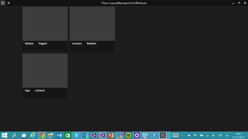
The page contains two controls to display collections: GridView and ListView. Then, in the page resources, I’ve defined a CollectionViewSource object, which is connected to a collection in the ViewModel. As you can see, both controls are connected to the same CollectionViewSource: the result is that both of them are displaying the same data. However, there’s an important difference: by default, the GridView control is displayed, while the ListView one is hidden (you can notice that the Visibility property is set to Collapsed). This means that, when the application is used in full screen, we display the data using a GridView control, which fits best this scenario, since it uses a horizontal navigation approach.
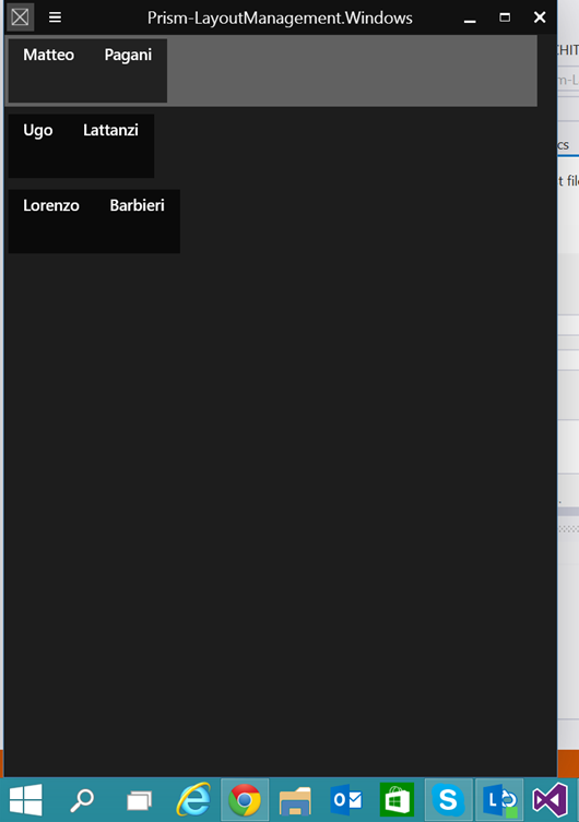
The VisualStateManager in the page, however, defines a visual state called MinimalLayout, which executes two animations, which interact with the Visibility property of the controls: the first one hides the GridView, while the second one displays the ListView. This way, when the application is resized to a size that would make the GridView impossible to use and read, we switch to a ListView control, which instead is easier to use also with a small size, since it displays the data with a vertical layout.
By default, the minimum width is set to 500px: this means that, when the application is resized to less than 500px, the MinimalLayout visual state will trigger. Vice versa, when the size of the application goes back to 500px or more, the DefaultLayout is restored. If you want to change this value, it’s enough to change a property offered by the VisualStateAwarePage class called MinimalLayoutWidth. The following sample shows how to set it, in the XAML, to change the minimum width to 800px:
<storeApps:VisualStateAwarePage
    x:Class="Prism_LayoutManagement.Views.MinimumWidthPage"
    xmlns="http://schemas.microsoft.com/winfx/2006/xaml/presentation"
    xmlns:x="http://schemas.microsoft.com/winfx/2006/xaml"
    xmlns:local="using:Prism_LayoutManagement.Views"
    xmlns:d="http://schemas.microsoft.com/expression/blend/2008"
    xmlns:mc="http://schemas.openxmlformats.org/markup-compatibility/2006"
    xmlns:storeApps="using:Microsoft.Practices.Prism.StoreApps"
    xmlns:mvvm="using:Microsoft.Practices.Prism.Mvvm"
    mvvm:ViewModelLocator.AutoWireViewModel="True"
    MinimalLayoutWidth="800"
    mc:Ignorable="d">

    <!-- content of the page -->

</storeApps:VisualStateAwarePage>
If you want to play with this feature remember that, by default, the minimum width of the Windows Store app is 500px: this means that, by default, you won’t be able to trigger the visual state, since you can’t resize the application to less than 500px. However, in the manifest file, in the Application section, you’ll find an option called Minimum width that will enable to you to change it to 320 px (which was the size of the old snapped view in Windows 8).
Wrapping up
As you usual, you can find the sample project used for this post on GitHub at https://github.com/qmatteoq/Prism-UniversalSample. Just remember that, this demo only, will contain just the Windows 8.1 demo, since the feature described in this post works only in Windows 8.1.
Index of the posts about Prism and Universal Windows apps
- The basic concepts
- Binding and commands
- Advanced commands
- Navigation
- Managing the application’s lifecycle
- Messages
- Layout management
Sample project: https://github.com/qmatteoq/Prism-UniversalSample


